
Table of Contents
▼Responsive Web Design Basics: Everything You Need to Build Mobile-Friendly Websites
Customised Web Development
- Jan 20, 2026
As users of smartphones, tablets, laptops, and desktops switch from one type of device to another in today's world, web designers have had to quickly adapt their designs. This means it's no longer acceptable to build websites for just one type of screen size; today, responsive web design is a fundamental requirement for any website that is created.
Responsiveness is about far more than being trendy. Responsive design is also a method of designing a website so that it automatically adjusts to different screen sizes, resolutions, and types of devices. Properly executed responsive design will lead to a better UX, improved web accessibility, increased page load speed, and it conforms to Google's mobile-friendly recommendations.
This comprehensive guide will cover the basic concepts of responsive design as well as the fundamental principles of responsive web design, what a responsive design entails, a comparison of responsive designs to the various other types of web design methods, and why working with a professional agency like Xcentric Services will make the difference between having a website that works and a website that performs.
What is Responsive Web Design?
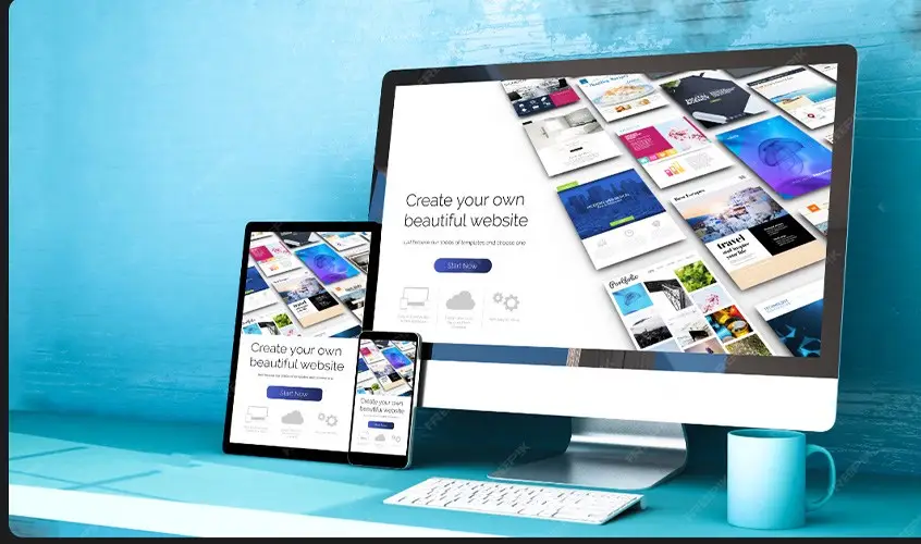
Responsive web design is a way to design and create websites that will automatically adapt their layout, content, images, and typography based on the device and screen resolution of the user. Instead of having to create multiple versions of a website (desktop, tablet, and mobile), responsive design uses a single flexible layout to provide content on all devices.
Responsive web designs will automatically adapt to the size of the user's screen, whether it is in portrait or landscape mode, and based on the method used to enter data (mouse or touch). The ability to have various levels of flexibility within the responsive web design is what makes responsive websites the basis for all mobile-friendly websites and for websites that are designed to be compatible with other devices.
Why Responsive Web Design Is Important Today

As user behavior has moved permanently to mobile devices and multiple device use, by 2025, the majority of all online user interactions will begin on mobile devices, no matter what type of device that interaction may occur on. The following three things are the primary reasons responsive web design is essential today:
- Mobile devices are responsible for the majority of the web traffic
- Mobile-first indexing is the primary way Google ranks websites
- Users expect seamless experiences across devices, and as a result of this expectation, a website must be responsive
If a business does not have a responsive web design, it runs the risk of having a high bounce rate, low search ranking, and a loss of revenue.
Responsive Web Design Fundamentals
The fundamentals of responsive web design are vital to building an effective responsive web-based business in the future. Responsive design focuses on enabling users to interact with websites responsively, as opposed to having to apply formally-planned design rules, and instead of waiting for input from an unknown demographic about how they plan to access a web page (e.g., laptop, tablet, smartphone), responsive webpages react to visitors instantaneously.
| Element | Purpose | Business Impact |
|---|---|---|
| Fluid Grid Layout | Scaling of design | Branding consistency |
| Responsive Images | Maintaining design standards | Decreased load times |
| Media Queries | Responsive design programming | Multiple platforms (devices) |
| View Port Control | Designed for mobile devices | Enhanced user satisfaction |
These elements work together to create a positively functioning website regardless of a user's screen device.
Responsive Web Design Principles
Excellent responsive websites utilize established principles that guide the establishment of the underlying framework used by both design and development teams.
1. Fluid Layouts and Flexible Grids
Fluid layouts utilize relative dimensions of the design elements as opposed to fixed dimensions, allowing for content/responsiveness via the size of the screen on which users access a web page. Flexible grids provide the physical framework for fluid layout responsiveness.
The advantages of using fluid grids include the ability to easily create a design that responds well to an unknown screen size. It also establishes consistent design continuity across all devices (laptops, tablets, smartphones, etc.). Moreover, it significantly reduced resources invested in redesigning websites due to the emergence of new types of devices. This principle represents the crucial component associated with long-term scalability.
2. Media Queries And Device Adaptation
Once media query technology was introduced, website development was greatly enhanced, allowing web developers to design a web page based on screen height, width, and screen orientation.
Media queries are the primary decision-making tools that enable website layouts to adapt intelligently to users on multiple platform devices. These are used to create optimized layouts targeting CSS breakpoints and help make a better experience for users on smaller screen devices. They allow user interaction to be adjusted based on the user's device and are an essential element of how responsive design works and today's frontend development.
3. Flexible Images and Media
Images/media are flexible because they adjust to fit within their container while still sharing their intended visual clarity. This allows for better performance optimization along with less page load lag time. This consistent appearance on all devices contributes to a responsive design with breakpoints that help to understand the general ranges of screens on all devices.
Common Screen Sizes and Responsive Breakpoints
Although responsive design was not created with the intention of targeting specific devices, knowing what the average range of a device's screen is helps with how you lay out your website.
| Device Type | Screen Size | Design Focus/Importance |
|---|---|---|
| Smartphones | Small | Touch-friendly experiences |
| Tablets | Medium | Evenly distributed layout |
| Laptops | Standard | Content Density |
| Desktops | Large | Visual Hierarchy |
Responsive design breakpoints guarantee that a website will remain usable, but will be able to be responsive in a variety of ways.
Mobile-first Design: A New Standard for Web Development
The mobile-first approach to responsive web development is a significant shift towards designing for the smallest possible device first, and then improving upon that for larger devices. Instead of tearing down desktop designs, a mobile-first design builds upon:
- Essential Content
- Easy-to-use Navigation
- Efficient Performance
This mobile-first strategy works because it automatically enhances the mobile experience by design and encourages what content is most important. This also reduces excessive complexity and is in line with Google's mobile guidelines.
Adaptive Design vs Responsive Design

There is often confusion between adaptive design and responsive design because they are both used by modern web developers to ensure a user-friendly experience across all devices. However, there are some differences in the way they work together.
| Feature | Responsive Design (Fluid) | Adaptive Design (Fixed) |
|---|---|---|
| Layout Behavior | Adaptive Design | Page Layout Behavior |
| Screen Support | All screen sizes | Limited Presets |
| SEO Performance | Strong Performance | Moderate Performance |
| Maintenance | Easier to Maintain | More Complex Maintenance |
| Future Scalability | High Potential for Scalability | Limited Scalability |
For most businesses, responsive web design provides more flexibility, better SEO performance, and lower long-term costs.
The Basics of Responsive Web Design for Today's Websites
When it comes to developing a website using responsive design methods, there is more to consider than just layout. It is also about how content is going to be structured, how users are going to navigate through the site, and how you will optimize site performance.
Examples of key factors to think about:
- Organizational structure for content hierarchy
- Uniformity in navigation across devices
- Text font sizes that will scale to fit
- Ease of use for touch with no issues
Technologies that help develop these principles include HTML, CSS, and CSS grid layouts.
UX Design and Responsive Web Design
Responsive web design revolves around the theory of user experience (UX) Design. Regardless of how the website is being accessed, the website should be easy to navigate and should be equally usable.
Examples of UX features of responsive web design:
- Good legibility of text font size on all screen sizes
- Sufficiently sized buttons for touch
- Clearing of space to prevent accidental clicking
- Reasonable and predictable navigation patterns
By having a responsive design that adapts to the user's environment, responsive web design increases the user's sense of satisfaction and willingness to engage with the site.
Web Accessibility and Inclusive Design
Responsive web design has created a more accessible internet by enabling the usability of content across devices and assistive technologies. The benefits of web accessibility included improved text scaling and reduced horizontal scrolling. They have better compatibility with screen readers and support for keyboard navigation. Even the best-constructed responsive web layouts will fail to perform if they load slowly.
The direct impact of responsive web performance optimization on user experience (UX), SEO performance, and conversion rates.
Google's Mobile-Friendly Guidelines & SEO
Mobile-friendly websites that are optimized for mobile UX rank higher in Google searches than those that do not provide an excellent mobile experience. To ensure that all forms of content on a webpage can be viewed without zooming, be readable on most devices, have touch screen functions that function seamlessly while navigating through a site; and load quickly over mobile networks, a responsive website uses responsive design principles to maintain the rankings and improve long-term visibility of the site in search engine results.
A responsive website will always be a critical consideration for:
- Beginning designers who are learning the basics of web design
- Designers who focus on the UX and accessibility of websites
- Developers who are creating scalable systems
- Businesses that are targeting mobile-first audiences
If you are using resources to learn about the basics of responsive design or launching your own site, our responsive website design services provides the foundation for the way your website will ultimately function and perform.
Businesses that Partner with Xcentric Services for Their Website's Responsive Design Needs

While understanding responsive design for a business is helpful, implementing responsive design properly will require a combination of experience, strategy, and technical precision, which is one of the many services provided by Xcentric Services. We specialize in providing quick mobile-responsive web design services that incorporates the visual excellence of the finished product and the highest level of performance optimization possible.
What Separates Us from Our Competitors
- Custom responsive layouts designed specifically for real users
- Mobile-first designs that meet the current mobile-friendly certifications provided by Google
- Properly architected base formats that will meet Google's expectations for SEO
- Scalability to accommodate the future growth of any company
Xcentric Services does not use cookie-cutter template websites to build/launch responsive websites. Each website is designed and built to provide measurable returns on investment.
Scalable Websites for Future Growth
Xcentric Services offers custom websites design services that are responsive to their customers. The websites are tailored for each customer and can be measured against the desired results of the customers' businesses.
Checklist of Responsive Web Design Best Practices
| Area | Best Practice |
|---|---|
| Layout | Fluid grids |
| Images | Flexibility |
| Devices | Multiple screen sizes |
| UX | Touch Optimized |
| Performance | Load speed and performance |
| Accessibility | Follow web standards |
Conclusion
Responsive web design is no longer an option; it is now a standard practice for new websites. With responsive web design principles, fluid grids, media queries, and mobile-first design, businesses can create fast, user-friendly digital experiences and prepare for future changes in their customer base.
For businesses that want to go beyond compliance and focus on their bottom line, growth, and scalability, partnering with Xcentric Services will provide you with a responsive website built according to industry standards and best practices for today and into the future. As multiple devices and user behaviour continue to change, responsive web design will not only provide great service to customers, but will also improve how businesses operate.
Frequently Asked Questions (FAQs)
Q. What is responsive web design?
Responsive web design is a way to create a website that adapts to different screen sizes by employing fluid layouts, media queries, and fluid grids.
Q. Is responsive web design still relevant in 2026?
Yes. Responsive web design continues to be the industry standard for creating a mobile-friendly website and meeting the SEO and accessibility guidelines of the industry.
Q. What is the difference between mobile-first and responsive design?
Mobile-first is a part of the responsive design strategy, but is focused on the small screen experience first, and then adds enhancements to larger devices.
Q. How does responsive design affect SEO?
Responsive design will benefit SEO through support of the mobile-first indexing, decrease bounce rates, and allow for an increase in page load speed.
Q. Will responsive web design help with conversion rates?
Yes. By improving UX and page load speed, as well as making it easier for a user to interact with the website, better UX and page load speed will lead to more interaction and increased conversion rates.
Q. Will responsive design work for every industry?
Yes. From e-commerce and software as a service to healthcare and professional services.
Q. Should I convert my old website to a responsive design?
If your site does not have a mobile version, it is highly suggested that you redesign your site as a responsive website in order to remain competitive.

Share


Want To Increase Your Ranking On The Search Engines?
Get In Touch With Us!
What To Read Next?
As users of smartphones, tablets, laptops, and desktops switch from one type of device to...
Xcentric Team
6 MONTHS AGO

Xcentric Team
17 MONTHS AGO

Xcentric Team
18 MONTHS AGO


